
Not for profit organisations have been too slow to invest in digital, and they wonder why they’re not generating revenue online
I’m not releasing breaking news when I say that not for profits have been slow to take up digital as part of their fundraising strategy. However, I think what might surprise my non profit readers is how I can quantify what this digital resistance has cost them.
Engagement (attracting digital donors)
Because not for profit organisations don’t care about, or don’t ‘get’ digital, they don’t understand how to create content that is important to online users. When it comes to giving, a charity’s mission and goals must align to a donor’s individual morals and values. Online donors don’t use social media to research who to donate to like they do with consumer products. What they are influenced by in social media is what their friends care about. Your best chance to attract a new donor in the social media space is through focusing your communications on your target audience. If they respond positively, it will spill over to their peer group when they share the content and express their personal relationship to this cause.
It doesn’t matter how good your appeal or campaign is if I don’t care about it. So too-frequent, commercial style posts on social media are annoying potential supporters. They want to hear about the personal stories of the people that your charity has helped. No amount of sales pitch posts will convince them to donate.
What you have to do is create content that is real and showcases your organisation’s work ‘on the ground’. Organisations have to accept that a large portion of the population will not respond to their cause – but that’s ok, they only need to engage the people who do resonate with their mission to attract donations.
Peer to Peer fundraising event campaigns like ‘World’s Greatest Shave’ and Movember are bringing in 60-70% of their revenue through digital channels (mobile is prolific for event fundraising). These are not fun causes (cancer) but they are fun campaigns. ‘World’s Greatest Shave’ is an incredibly emotional experience for those participating, shaving your head makes many people feel very vulnerable, but they’ve kept the campaign messaging light and positive. I know not every brand or cause has a national event to leverage its digital strategy from, but these examples can give you inspiration and help you think differently about the strategy for your next appeal.
Poor online experiences (mean bad conversion rates)
But the biggest digital sin that non profit organisations are guilty of is not converting those supporters who have shown an interest and an intent. Research from Nielsen Norman Group into how people behave on non profit websites, as opposed to our corporate eCommerce counterparts, shows that it is 7% harder to make a donation than it is to buy a product. This is not about budgets or resources or brand or cause, this is plain and simple website usability. Amazon.com released a statement a while back quantifying that for every additional second it took their website to load, they could lose $1.6 billion in revenue annually.
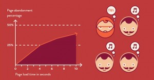
The drop off or abandonment rate of online shopping carts is impacted greatly by the load time of the page.
This loss of potential revenue figure comes from the amount of people who abandon their shopping intention because they’re frustrated. If a charity organisation is already 7% worse than their eCommerce competitors, and you’ve got a smaller audience segment to target because of the need for their values to align for them to consider giving, then its imperative that organisations get their online experience, and payment gateway, right.
The Nielsen Norman Group says “Giving money on charity websites is 7% harder than spending money on e-commerce sites. Donating physical items is even harder. For non-profit websites, social media is secondary; the top priority is to write clearer content.” This 7% harder figure comes from the time it takes a user to complete a donation form on a charity website compared to the time it takes to buy a product on an eCommerce website.
Apparently the figures get even worse with a charity tries to offer non-financial digital actions for their supporters or asks them to buy a physical product. This does not bode well for the many organisations who have launched online shops in an effort to diversify their fundraising and find a new audience. It appears that they’re likely scaring off their potential new donors instead of engaging with them. What a lost opportunity, and all because they haven’t put enough time and care into making the purchase process easy.
An online usability checklist (to help reduce your donation drop off rate)
Here a few humble suggestions for how you can optimise your overall website and donation forms to try to reduce the drop off rate:
- Invest in premium hosting. Hosting is not expensive in the grand scheme of digital things, pay a little more each month to make sure that your website is faster (of course the code of your website will impact this, but like your home computer, you can do lots of things to improve its speed)
- Keep your appeal landing pages and online donation form to just 1 page, and if you can’t, use a step by step progress bar so the user can see how far they have to go. Try to keep it to 3 steps maximum An easy place to start is by getting rid of the ‘confirm your details’ step
- Make sure that you have a mobile version of the form, that uses the phone’s native mobile functionality – over 75% of people open their emails on mobile devices, so make it easy for them to follow through on their intention to donate
- Try to have no more than 7 form fields on your donation form – I know you want to know more about them, but get the donation first and build your constituent record with richer information over time
- Make sure your donation buttons and call to actions are clear on your website – use a contrasting colour to the rest of your web design so that they stand out (digital success is more about form and functionality than it is about design. Some of the most successful websites in the world are ugly, but they are easy to use)
- Clearly, on the donation or appeal page, tell the supporter how you will spend the money
- Make sure that your website really is secure and that your SSL security certificate is up to date. The last thing you want is a warning message to pop up when your supporter is trying to make a donation. And it doesn’t hurt to have a clear badge of your verified online security (the padlock icon).
Actioning all of the above suggestions will only cost a few thousand dollars, but if you can reduce your drop off rate by just 3% (say from 80% drop off down to 77% drop off), it could mean a lift in revenue by over 270%. Take a look at my little scribbled conversion funnel.
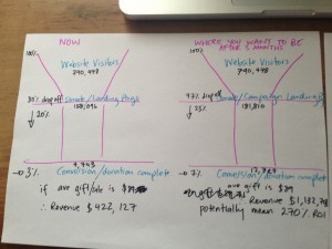
Parachute Digital can improve your online donation conversions
Parachute Digital can help you with this. Just take a look at the diagram and plug your numbers into this and see what potential revenue your business is losing right now.