
We’ve seen a few blogs around lately about the effectiveness of ‘ugly’ ads in mainstream advertising and thought we’d share our learnings from the Parachute wheelhouse on the topic.
Firstly, what do we mean by ugly ads?

Gremlin is adorable. But this “ugly” image worked well for donations.
They’re ads that are designed to get ‘cut-through’ by their raw, homemade appearance. They make viewers pause and take notice as they don’t look like the normal polished advertising they’re used to seeing. For example, they’re usually created by taking a photo on an iPhone or shooting a quick 15-second ad in bad lighting.
Charities are doing it a lot lately so what’s the logic behind it and do they work for fundraising?
Our beloved Digital Consultant, Vic, who has been dabbling with the odd ‘ugly ad’, tells us that “there is no hard and fast rules.”
“It’s important to test different types of ads in your organisation with a variety of messaging. However, when I’ve specifically tested ‘ugly ads’ within social-based organisations that provide practical support like food and housing, I’ve seen a huge difference!”
Why? According to Vic, it’s because it feels authentic and people connect with other, real, people: “In one
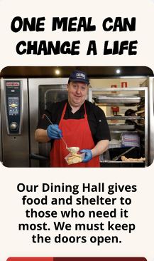
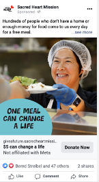
A non-stylised volunteer image is the best performer for Sacred Heart Mission.
campaign, we found that the best-performing image was of a volunteer holding a huge tray of soup, smiling. This was interesting because we had images that highlighted the ‘need’ more, however, the smiling volunteer worked better in driving donations.
It’s all about authenticity; people can tell when it’s a real person with a real connection to the cause. In this case, the volunteer was wearing a branded shirt, so the connection was clear. And their donation was going to something as simple as a bowl of soup, it made the impact feel tangible and real.”
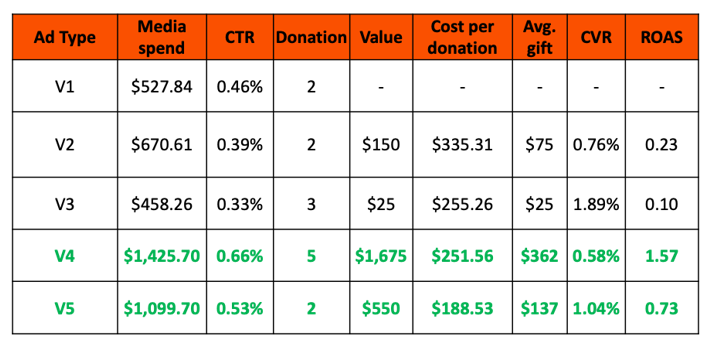
In another campaign, Vic tested ugly ads with different messages but with stock imagery since they couldn’t use real people.
“As you can see in the performance below Versions 4 and 5 used creative with just plain imagery of volunteers with food and performed amazingly – 1.57 vs 0.23 ROAs!”
Where do ugly ads work best? Is it limited to Facebook or Instagram?
“Right now, we’re not seeing Instagram perform as a strong channel for fundraising in general,” says Vic. “However, I have seen organic, ‘ugly’ images perform better on Instagram versus sleek professional images from a page engagement perspective. Content is always the key.”
When it comes to your website, however, high quality images are better according to Vic.
“You should always try to use the best quality images you have available. Bad image quality will render badly on large screens. Brand objectives are different to fundraising.
On a fundraising page if you don’t have amazing quality images available, but you have images of volunteers at work, and food going out, then use it. It’s about showing impact.”
So, do you ever use good-quality images in fundraising images?
“Header images on a landing page do need to work for many devices and screen sizes, so it is important to have a good-quality image. But don’t shy away from an ugly image in blocks 2 and 3, and don’t shy away from them in your paid ads. They can work better than stylised images. It’s always important to test it for yourself and see what type of imagery works for your cause.”


We’ve seen the results, and we know the ugly truth about beautiful ads and fundraising. Has your team dabbled in them? Share your results with us!
Need some creative help? Get in touch!