Top UX tips to improve your website user experience
When building a new website, we all put A LOT of thought into it.
The design especially. The content for your website takes AGES.
We labour over the homepage and what should go there.
But so many websites miss the important and simple things that make it work well for the end user – your supporters and donors.
Here is an excellent list of simple things to make your website more successful (From Wired Impact)
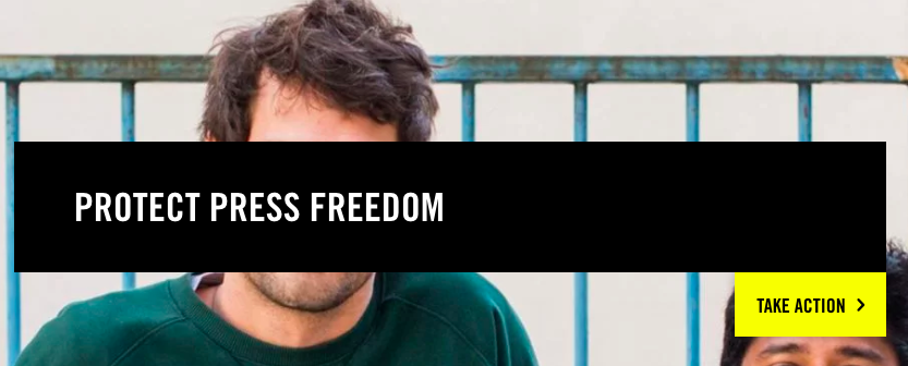
1. Make your text a high contrast colour
Designers love to use grey on websites, most websites now seem to have it, but it’s SO HARD TO READ. Stop it. Just stop it. Use BLACK text on a white background.
![]()
2. Make your links obvious
Make sure hyperlinks are underlined, in a visible colour, and easy for people to see and identify as links.
Don’t make people try clicking on headers and images that don’t click. This is frustrating and you’ll lose them.
I had to go through many of the big global websites to find an example where the links were underlined. FUNCTION OVER DESIGN people.
3. Make sure your website is responsive on mobile
Sounds obvious, and most new websites are, but Homepage header images still often don’t resize for the mobile screen. If I can’t see what your primary call to action is, then I can’t take the action.
Also, make sure you know immediately if anything is broken. Usually a well meaning potential supporter will let you know.
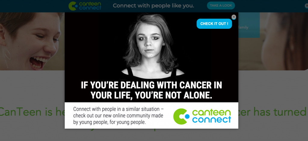
4. No pop-ups within first few seconds
Pop-ups that load immediately when someone lands on your page are disorienting. Have them show at least 10 seconds after someone loads a page.
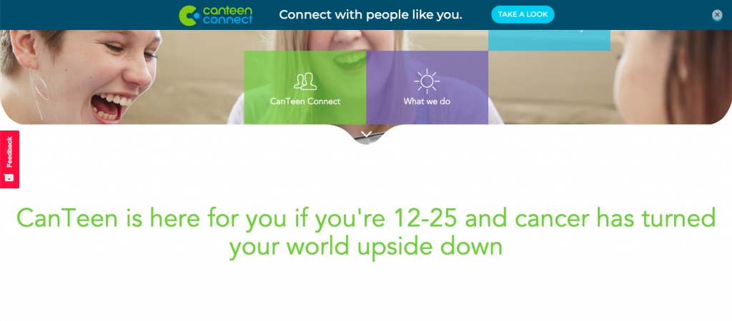
5. Static Header Images are better
Don’t add a huge rotating image carousel.
Rotating images on the homepage are bad news. Don’t do it!
6. Tell me what you do immediately at the top of the Homepage
Not using the homepage to say what your organisation does is a terrible brand experience and a missed opportunity.
Make what you do very clear to your visitors. They’ve come to check you out, make it easy for them to understand and choose what to do next.
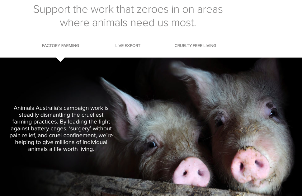
 7. Use good quality images
Small or low quality images are a no, no. In the world of the 12 Megapixel phone camera, we all have access to decent images.
Or pony up the cash and buy some. Images build emotion and in our visual culture, they matter more than the words. So don’t waste an opportunity to connect and convey.
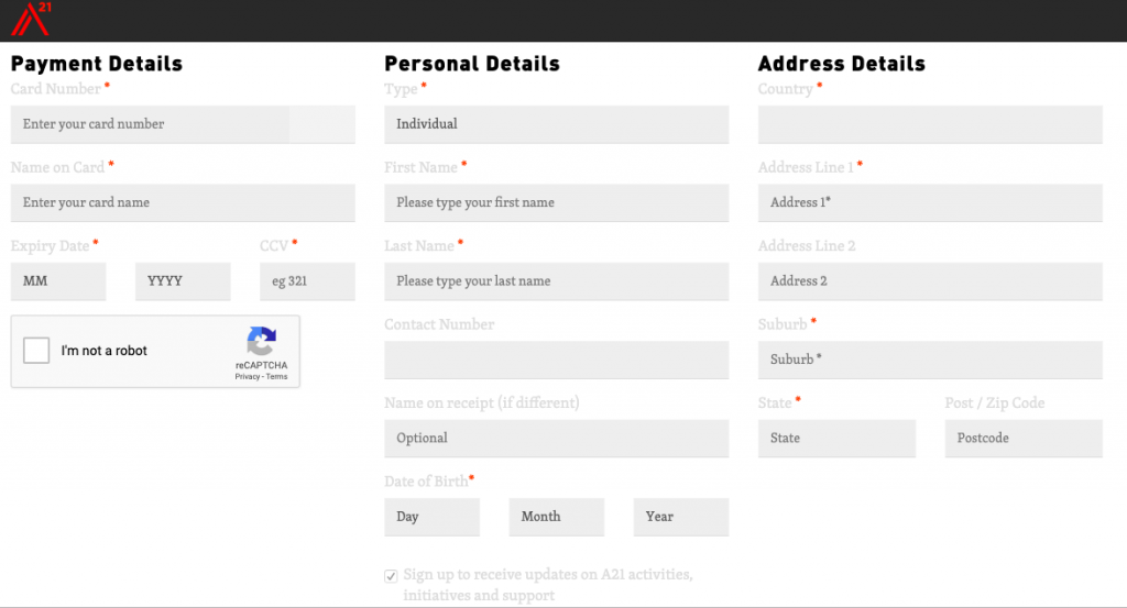
8. Your forms should only ask for necessary information
Review your forms and if they’re long and detailed – requesting 20 items of information from your supporters that is not required for the task they are trying to complete (contact us form or download information) or the action they are trying to take (petition or donation) – remove it!
The longer your forms are, the less they work. (DONATION PAGES PEOPLE!! C’mon)
9. Make your button text specific to the action
Don’t use generic button text like SUBMIT.
Have buttons say what you want the support to do – like DONATE, GIVE, or SAVE A PUPPY.
Not SUBMIT.

10. Write content that’s easy to scan
People don’t read your website in detail, they scan it. So make this easy for them (you’re not going to change their behaviour, no matter how good your text is).
Use short paragraphs and plenty of headlines to make it easier to read.
11. Prioritise your calls to action
Think single minded proposition at all times. Each webpage should only have one next logical step or call to action.
If you have multiple things you need your supporters to do – split them into multiple pages/ actions.