
Building Emotion With Dark Images
I learnt something new about building emotion with images recently. I love learning new stuff about user experience.
I am an advocate of real photos for webpages over stock images or photoshoots. I want to be true to the story, so that means using an authentic image. I don’t like it when the image is treated or jazzed up to make it more aesthetically pleasing, because I believe that users view it like an ad and don’t give it the same attention (similar to banner blindness).
Donor acquisition landing page
I was doing an online donor acquisition program for Mission Australia which required me to collaborate with their excellent web design/ web developers – Butterfly.
This revelation came up when we were working on the designs for the website landing pages (that the email journey would click through to).

Original image for Landing page
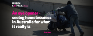
This is the image used on the Mission Australia landing page
Images affect the user experience
On several of the pages the designer had used quite dark images at the top of the page. I’d given some feedback that they were hard to see and could we perhaps use a different image or lighten it up.
After a couple of rounds of my feedback being ignored I asked to have a conversation about the designs. In that meeting I learned 2 really cool things:
1. Dark images – creating contrast isn’t just about the colour of text
Darker images can help to create mood and their lower visibility draws people in and makes them look more closely.
In the case of Mission Australia, the darker image created a strong contrast with the bold white title of the page.
The second thing that the darker image emphasised was the call to action to “scroll down”.
If you look at the two header images that were tested, you could be forgiven for not easily identifying the differences. Really we’re talking about a slight difference in the height of the image and the size of the font in the header and the 2nd segment text.
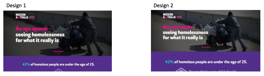
Two designs tested – the difference only font size and how dark the image was
2. Your call to action doesn’t have to be a bold button
Using a focused or stepped layout with really subtle visual cues (like a down arrow) increases the likelihood of a person to scroll down the page and want to see more.
In the Mission Australia example, the objective for this page was to engage prospective donors and get them to care about the issue. The call to action on this header image was a simple scroll down to take the poll. As you can see it was quite subtle in terms of the visual prominence on the page. However, you can see from the eye tracking that the first version clearly was more obvious to people looking at the page.
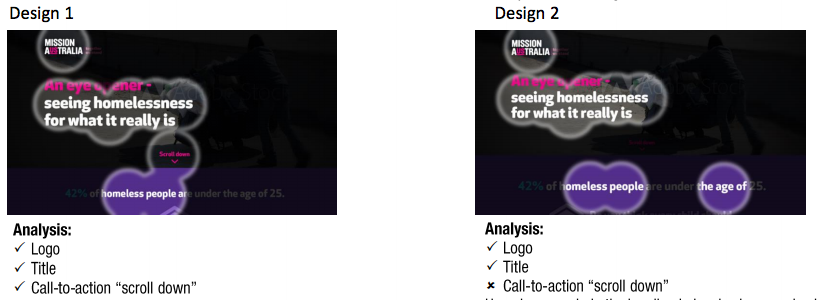
Perception Map from Butterfly’s user experience (UX) testing
Images are important
I guess what I’m trying to get across in this article is that images are important.
An authentic image (like the original image of the homeless man with the shopping trolly) that relates to the content adds real value. And if you’re going to use styling around the image, it should be about making the content easier to absorb and useful, whether its pretty or not should be irrelevant to achieving the outcome. As this work does.
The Mission Australia pages are gorgeous (in my opinion). And I’m so happy that there is a science to why they’ve made certain design decision that make the pages useful as well as achieve and outcome – like making the image dark, and we need to learn from this.
UX is a skill – communicate why decisions are made
So much of how we consume information and react online is subconscious and subtle cues can be the difference between our glance at the page turning into interest, or hitting the back button when we don’t immediately find what we’re looking for (or expecting).