
 Remember a time before Trump in 2016?
Or when we were just on our third leadership spill just after Tony Abbott?
Or when we were asking our donors for their name, fathers title, and their childhood pets name before we let them donate?
A whole lot changes in 3 years.
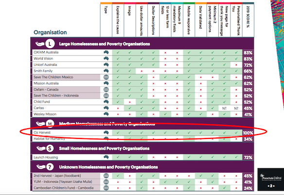
Our 2019 Donation Pages Research 2.0 has shown that. A lot has improved, and there is still a lot of room for improvement in the donation pages experience for donors. But one standout – OzHarvest – blew our minds with the strides they have made in the last 3 years to get a 100% in our scorecard.
So how did they climb up from a 50% ranking in 2016 to top our scorecard in 2019?
Explains the Cause, Where The Money Goes & Great Dollar Handle Description
Donors want to know what they are giving to and how their money is spent. In 2016, OzHarvest lost points for not explaining the cause.
But this time around, OzHarvest articulate their need and proposition – collecting excess food and re-supplying to those in need – effectively & simply. And it’s at the bottom of the page and present in every step of the donation process.
They also do an exceptional job of dollar descriptions and telling you exactly where the money is spent and the IMPACT of the donation. The donor knows exactly where their money is going and the tangible, direct impact of their donation. Plus, they have a donor promise at the bottom which instill trust in the donor that their money is being used appropriately.
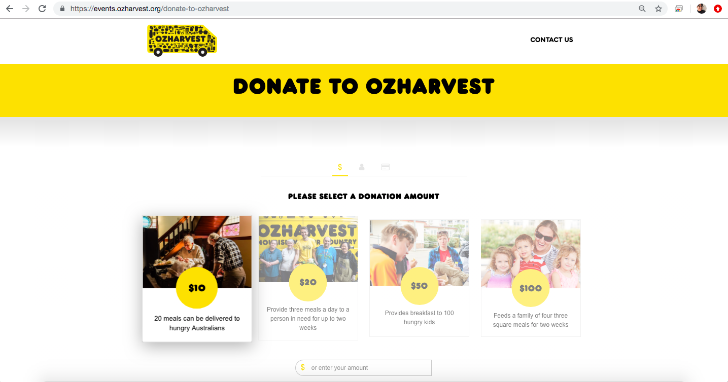
Effective Use of Images
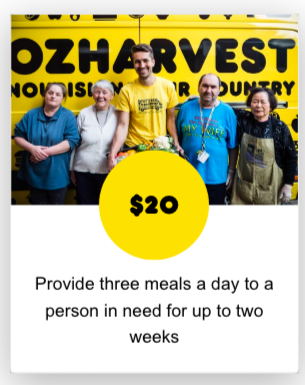
Not only does OzHarvest’s donation page benefit from striking black & yellow colour scheme, but they use images effectively intheir dollar handles to show emotion and the impact, and to make the “ASK”.
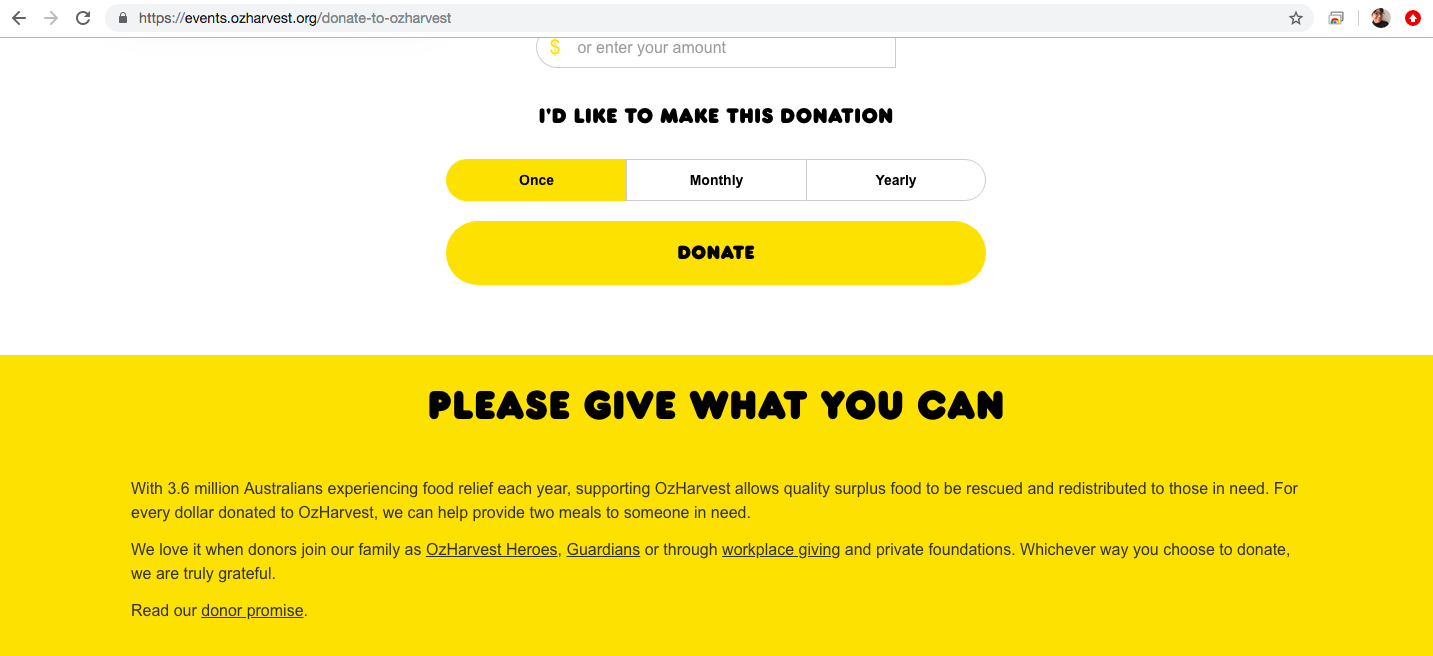
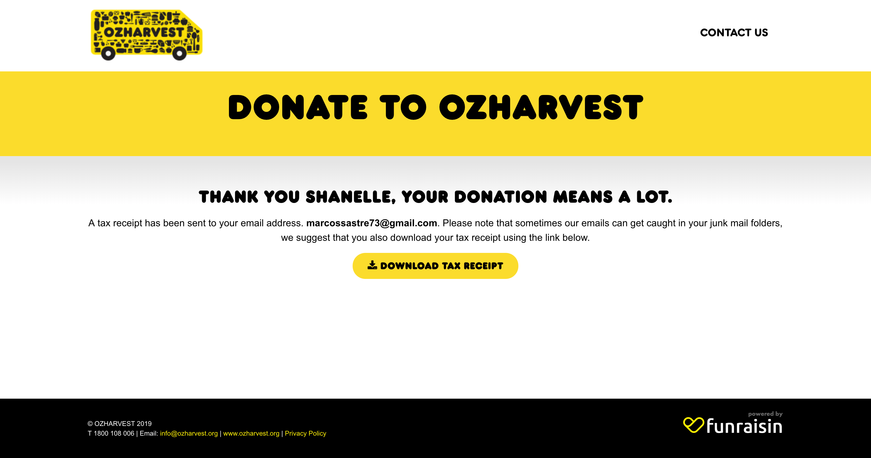
A Seamless Donation Experience – Form to Thank You
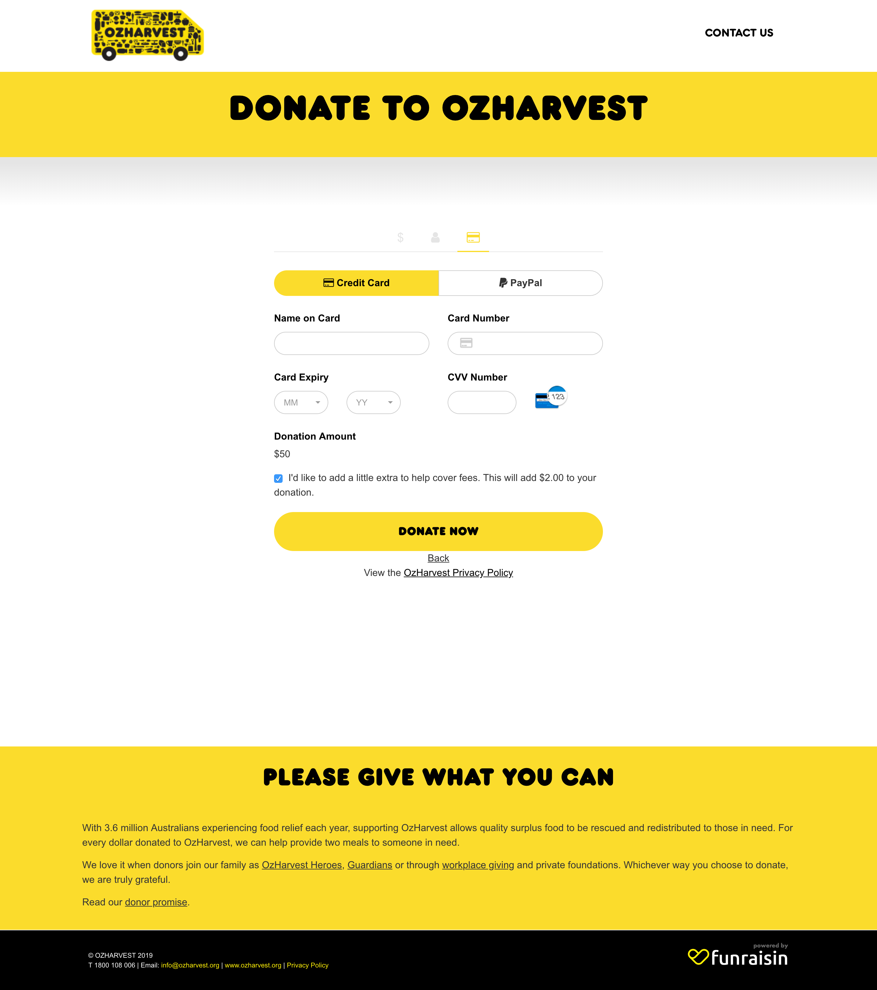
The number one factor that pushed OzHarvest from a 50% score in 2016 to a 100% score in 2019 is the way they have transformed their form & thank you page.
Despite our warnings in 2016, most of the charities were still asking for far too much unnecessary information. Plus, most of the unnecessary fields were still mandatory. This slows down the donation process and offers a slow & bad experience for donors.
In 2016, OzHarvest had:
- More than 12 form fields
- More than 9 of these mandatory
- No validation
- Only 1 form of payment
- No personalization in the Thank You page
This time around, OzHarvest has:
- 5 form fields, only 3 of which are mandatory (although if you enter address, more non-mandatory fields appear)
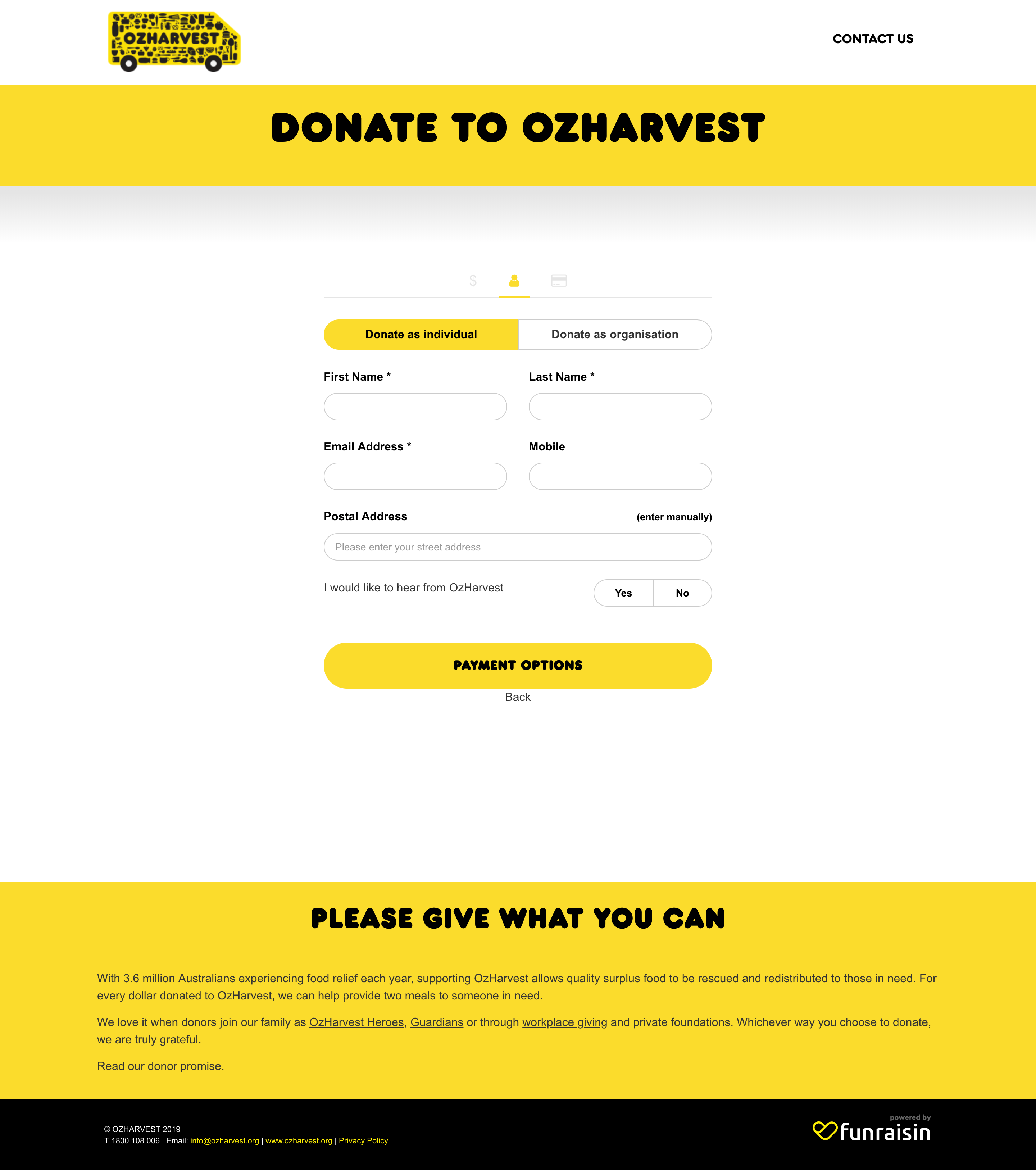
- Option to pay by credit card & PayPal
- Validate data
- Personalise the Thank You page with the donor’s name
The information is easy to pre-fill, the process is simple, fast and seamless, eliminating unnecessary steps from completing the donation.
Mobile-Optimised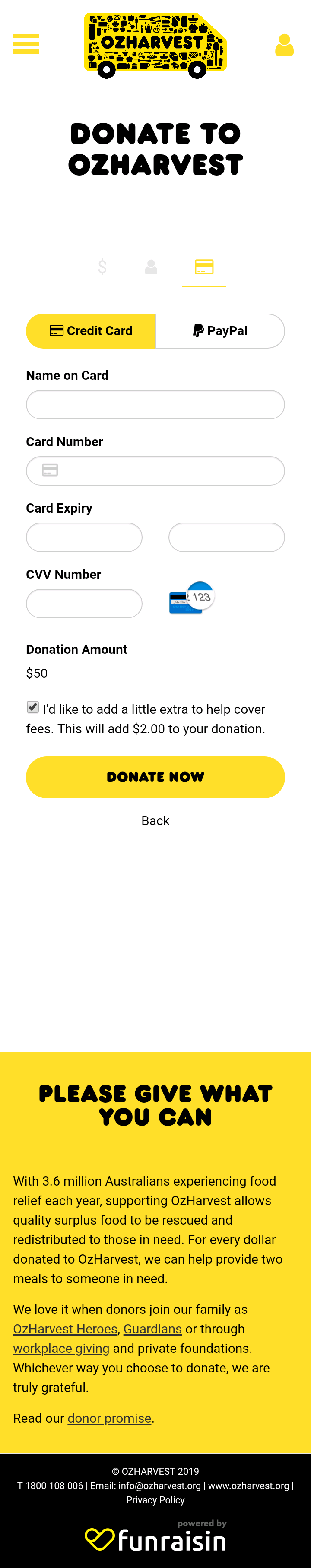
Oh, and isn’t the mobile experience just beautiful, too? But, almost all charities we profiled this time around were optimised formobile.
But Is It Perfect?
Yep, OzHarvest have done an exceptional job at upping their Donation Page game in the last 3 years. They tick off our 11 criteria for the donation pages to give the best donor experience, but one glaring issue (also apparent across most Australian charities) is security.
OzHarvest explains their cause, the need & impact, and provide you a seamless donation experience, but there are no indications that our data is safe. Like most i.e. padlocks on donate button and visual cues near payment area.
Want to learn more about the Donation Pages Research 2.0 or how your organisation stacks up? Please get in touch: ask.us@parachutedigital.com.au