Publicly available Australian Taxation data used to create a data mashup of sorts – Where Do My Taxes Go?
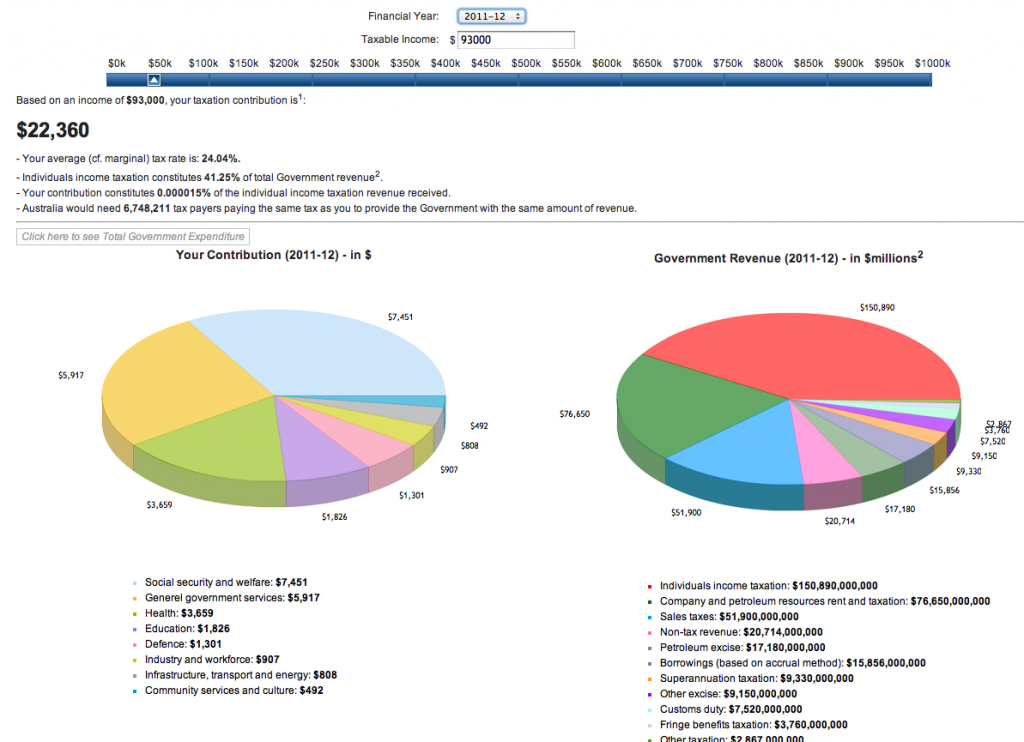
I’ve been looking for a good data mashup for a while to make a case study and the Where Do My Taxes Go? site comes close , as it uses publicly available information from government sources to calculate its graphs. The reason I say it comes close is because the creator, Ryan Kirgan, hasn’t actually taken a data feed that was made public by the Australian Government and turned it into easy to consume and understand graphs about where our income tax money goes, he’s had to create the data himself from tax structures and formulas provided by the Government/ ATO. Well that’s what I can ascertain from the small bits of information and sources quoted on the website.
The basic concept of the Where do my taxes go website is great – people feel that their income is taxed too much and that they don’t see the rewards/ uses of it. Of course we’re cynical and of course we don’t understand how involved it all actually is, but Ryan Kirgan’s website does at least provide some answers and raise some even better questions.
Ryan’s graph asks you to enter your total income and choose a financial year (because the income tax changes from year to year and from government to government and state to state in Australia) and then it spits out a graph that shows you a specific breakdown of how much of your personal income tax went towards education, defence, administration etc. Ryan has also put it into context by explaining where the government gets its overall revenue so that we, the people, can see that our income tax is not their only source of revenue.

Data Mashups take two sources of data and sometimes use them to tell a story different to what the data was originally intended for
I really wish the Australian Taxation system had released this information and that Ryan had used it to create an accurate graph, because at present this one is probably generally correct but littered with dozens of exact errors. But that doesn’t take away from the insight it gives the average consumer who has been feeling hard done by and that their taxes aren’t put to good use.
What I found most interesting was the comments at the bottom that grumble about the taxes omitted from the website (which Ryan has actually acknowledged himself in his intro blurb, right before the user enters their income tax and financial year “The calculator doesn’t account for the non-Income Tax contributions made by individuals, such as GST, Capital Gains Tax, Petrol Excise etc. so this shows what you hand over as a minimum.” This just shows people don’t read most of the words on the page). The comments paint a clear picture of our desire to know the full story, to want to see the actual statistics and dollars, not just representations of them. Kudos to Ryan Kirgan for putting this site together but I wish he’d been more committed and followed up on his users requests to include additional taxes that we pay, to show the true percentage of our income, before and after income tax, that Australians are paying to the Government for services that are (sometimes) provided, or at least appear to be provided to some Australians, if not all. Many of these comments are from 2010, so there’s been plenty of time to dig out this information.
Anyway, I will continue my search for a data mashup that informs and educates the public about a government or company who was prepared to bare all and release their data to anyone who wanted to see it. Most of us couldn’t make sense of it anyway, but there are a few genius out there who have the time, the know how and the care factor to put it all together for the rest of us.
If you have any good examples of publicly released data made friendly for the average Joe, please do leave a comment.
If you want to know more about Data Mashups, here is an easy to understand video. If I had found this BEFORE I wrote this article, I would easily have found another case study to use. It doesn’t matter as the Where Do My Taxes Go website was the inspiration and story I wanted to share.
